Propero
Client
Self-initiated
Role
UX/UI + Research
Timeframe
Aug 2021 - Oct 2021
Overview
A collaboration with Kevin (@KevinNeewen) & Simon (@S-C-Taylor).
Property prices in Australia have been skyrocketing since the start of the COVID-19 pandemic. Some people want to buy a nicer property to live in and work from, while others see this as a prime investment opportunity.
The idea behind Propero is to help property owners understand the value of their property and where their cash flow is going.
Propero landing pageWe also made an AI-generated landing page as an experiment.
Challenge
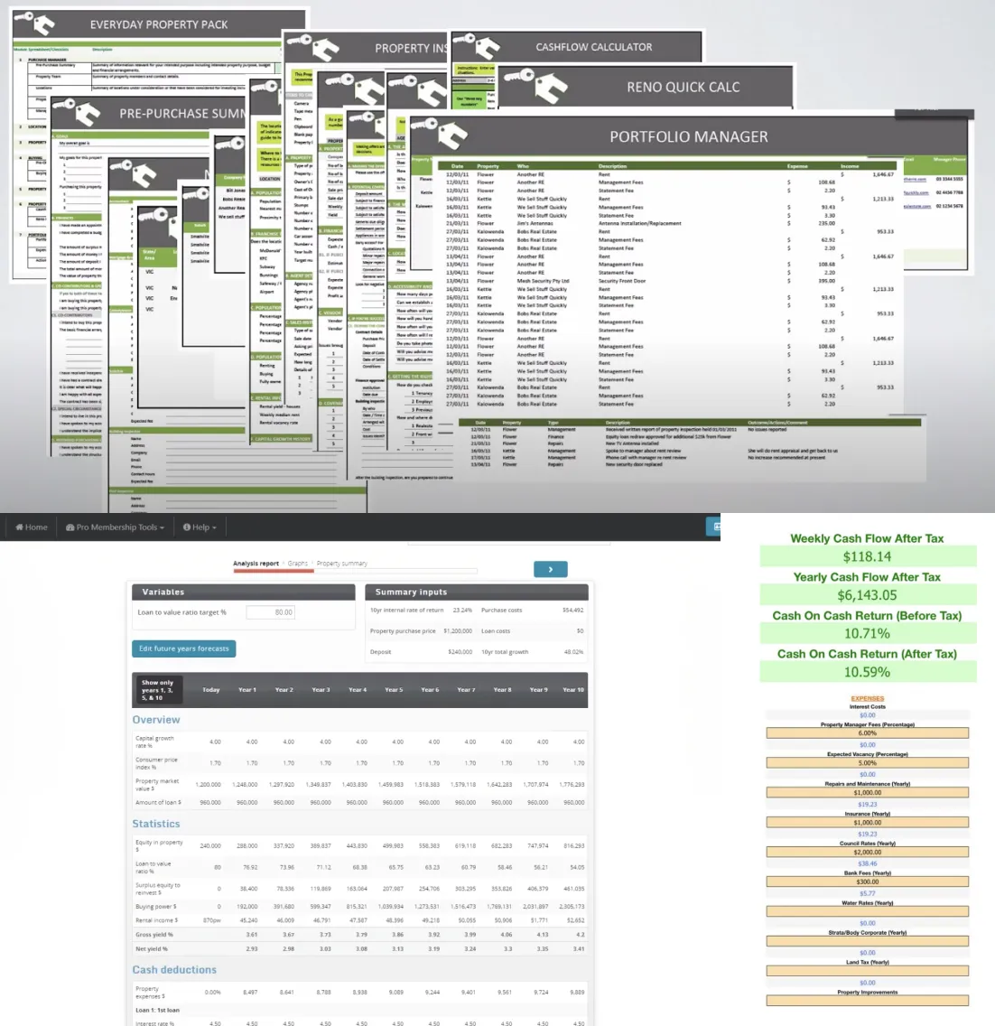
The idea for Propero originally came to Kevin when he faced difficulties in getting projections for the growth of his property. The tools that were freely available didn’t get the job done right or were completely non user-friendly.
Data entry for these tools would generally be through a bloated website built in 2009 or a giant Excel spreadsheet. Unless the user was a seasoned property investor, they would struggle to input the right data and get the outputs they wanted.
Another issue was the cost — some started at $250, while others went up to $2,000 per year.
Our focus was to provide a free and unrestricted product for all property owners.
Some examples of existing offerings:
As we were working on this product as a side project, we decided to set a hard deadline of 2 months. This did push us to strip out unneeded features for the MVP, while also having a visible finish line to work towards.
Process
Process breakdown
- Understand the product requirements from Kevin, who created the idea for this product
- Collaborating with Kevin and Simon to flesh out the product idea and see whether the product would be feasible for our intended target audience. We also had to scale back on some features to keep the focus on building an MVP
- Defining the information architecture and user flows, with a focus on simple onboarding and ease of use
- Iterating on mockups and wireframes to solidify the user flows and interactions
- Building higher fidelity designs to work them into a testable prototype for our initial users
Market research analysis
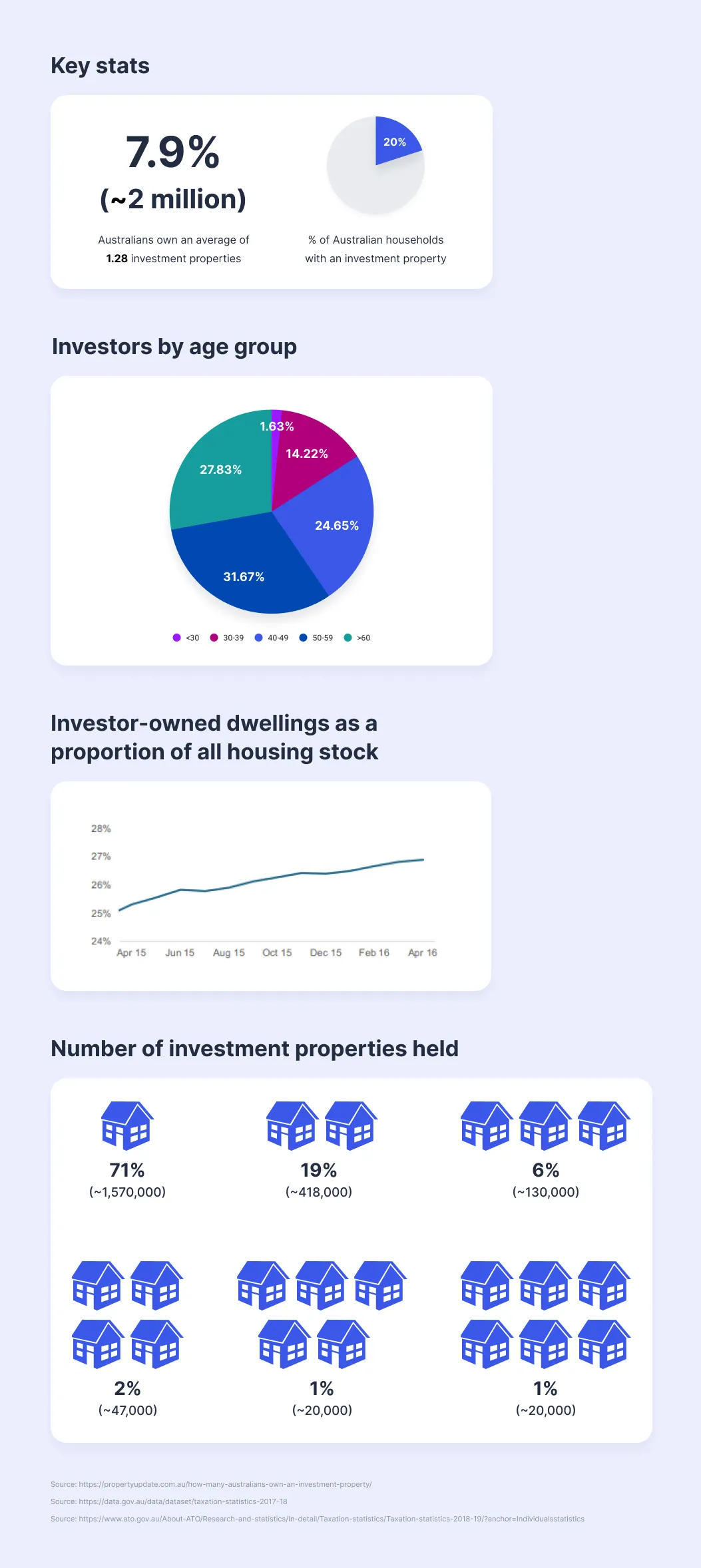
We began by researching the broader real estate market in Australia, with a focus on property investors. CoreLogic reports and ATO data gave us some visibility, however a lot of this publicly-available information was dated to 2019 (pre-Covid data).
Application flow
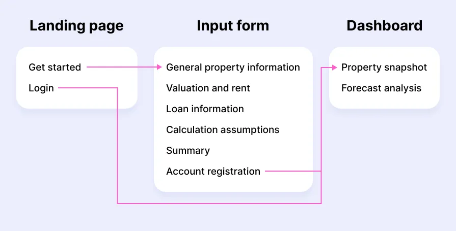
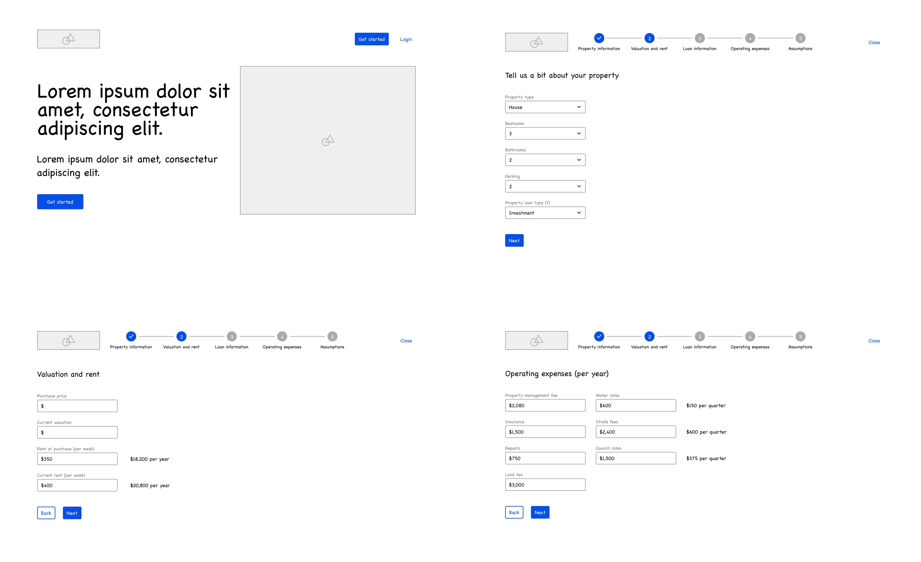
Creating a simple application flow allowed us to have a better understanding how our product would meet the user’s needs. Our idea was to have 3 core screens for our MVP — Landing page, Input form (onboarding) and Dashboard.
Mockups and wireframes
Input form
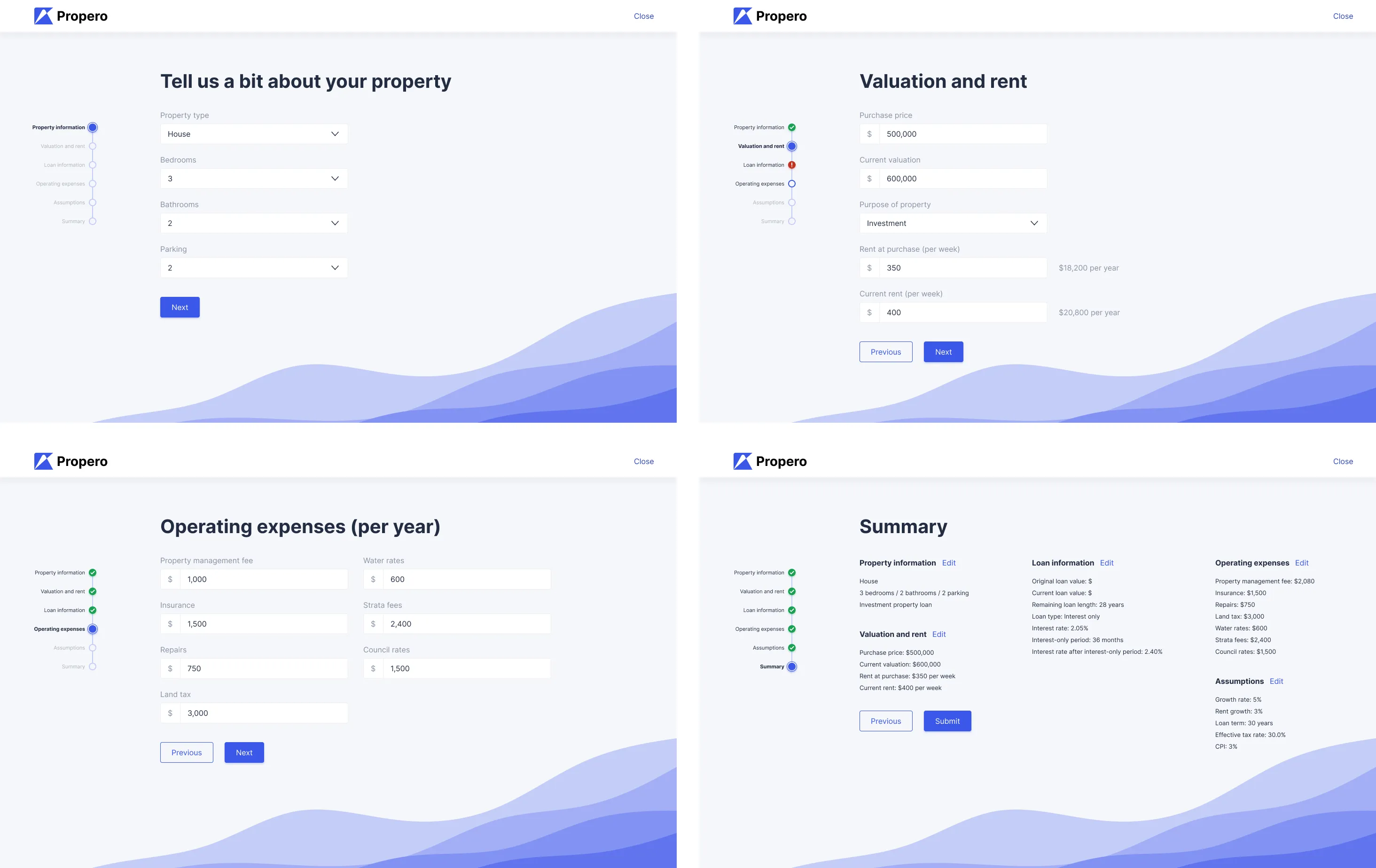
For our input form, we originally considered using a single page form, but we decided to pivot to a typeform instead. The multiple steps and screens broke down each section into more user-friendly chunks.
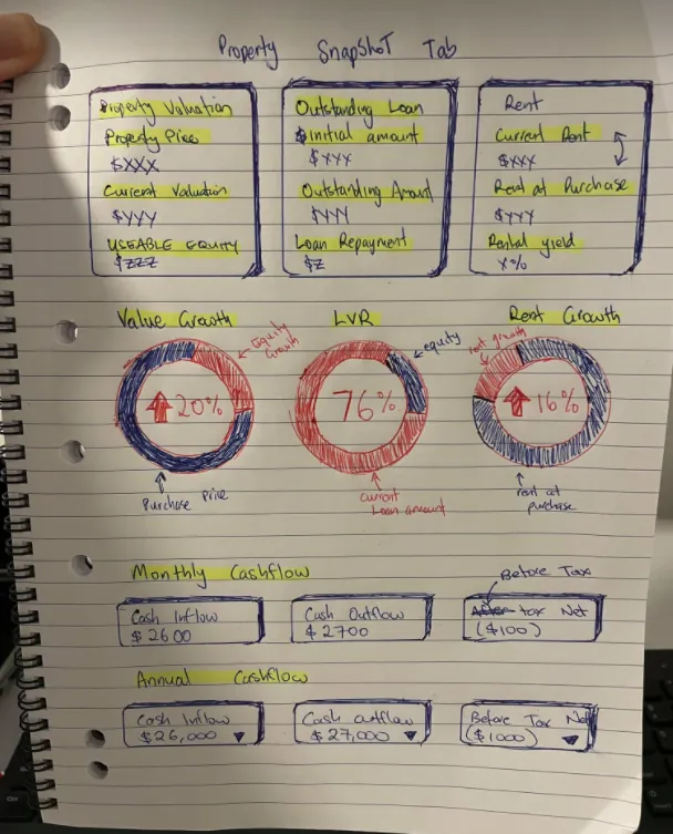
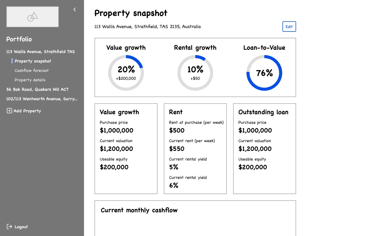
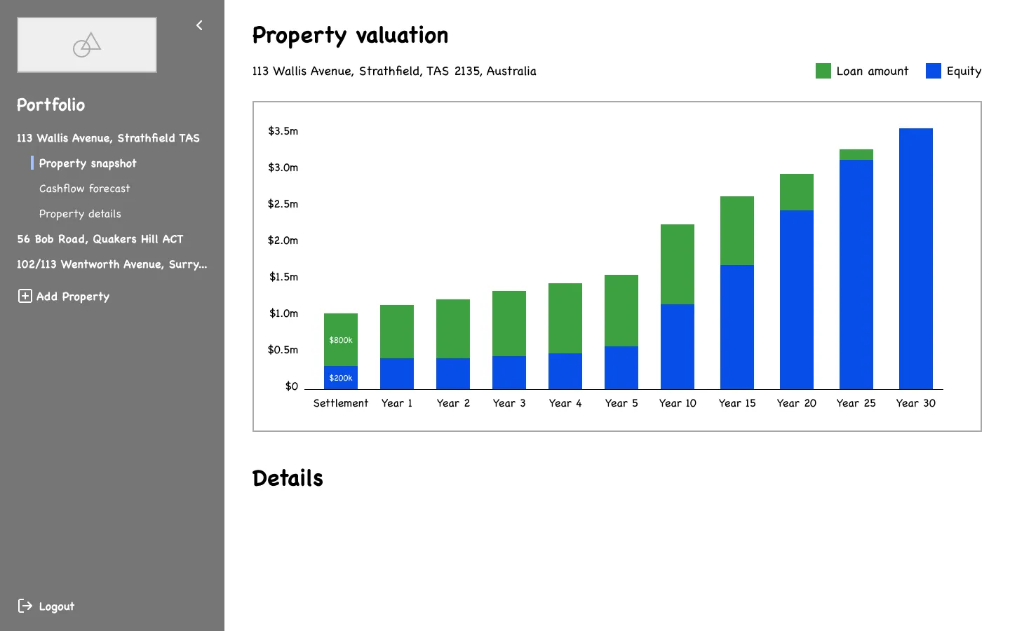
Dashboard
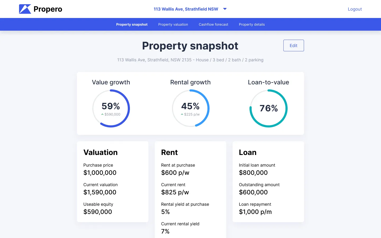
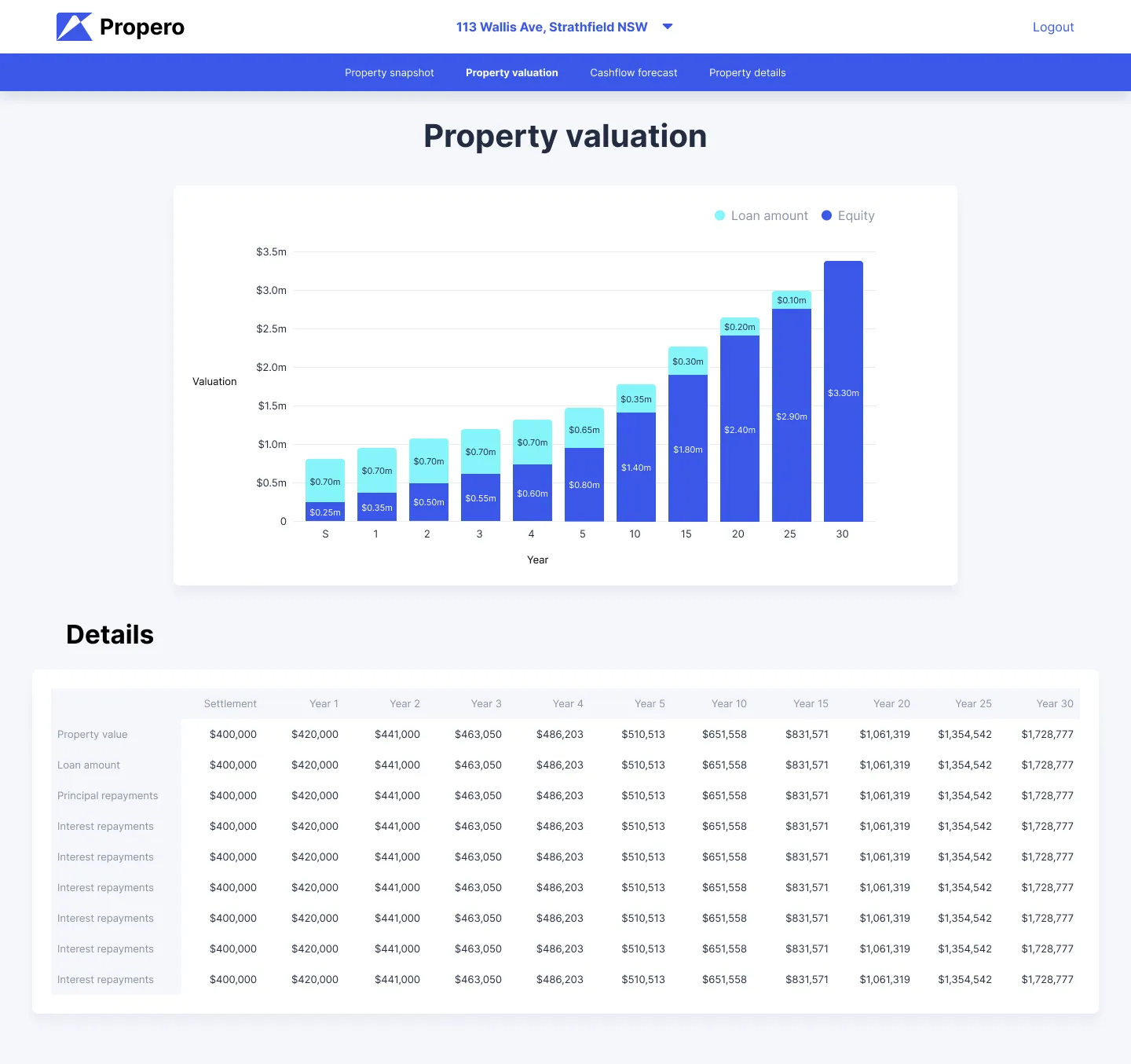
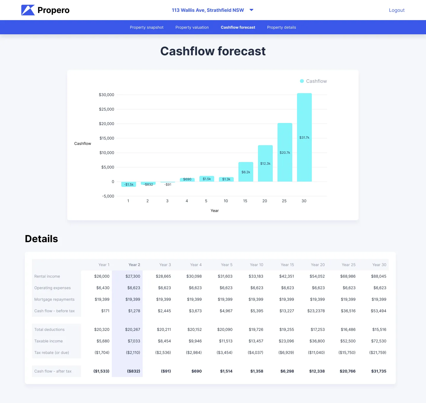
The dashboard was one of our “killer” features that would provide the user an overview of their property, while also showing their cashflow numbers.
Visual designs
Using the wireframes as the base, we dove deeper and inceased the fidelity of the designs. The landing page was kept clean and simple, with minor animations added.
We later refined the landing page using Framer.
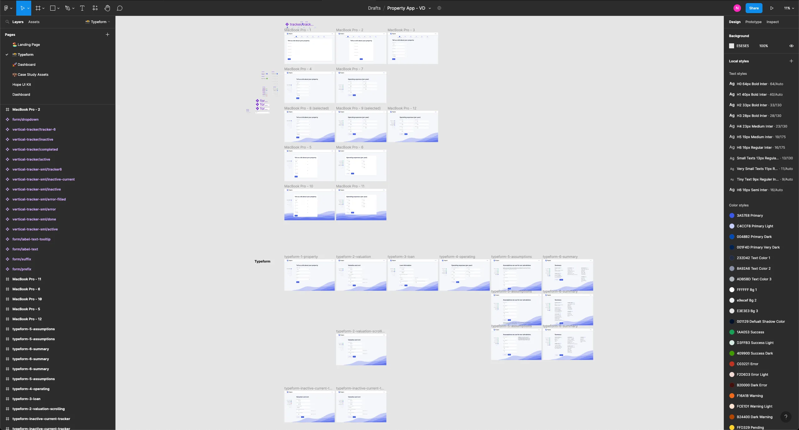
Input form
For the input form, we explored different locations to house the progress stepper. The original position at the top of the screen would cause issues on smaller screens as some form steps are vertically long. Moving the stepper to the left (on desktop breakpoints) fixed this issue.
Dashboard
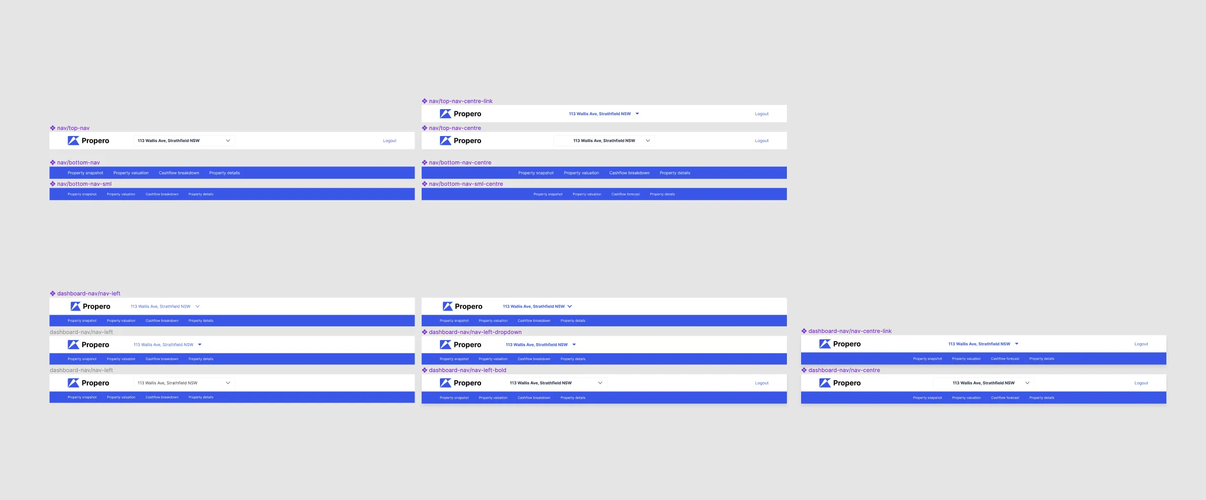
Navigation on the dashboard also required some modifications. The original wireframes had a left-side navigation to be consistent with some dashboard patterns, but this was problematic for long text strings (such as addresses). Either these strings would be truncated or the left-side nav would be unnecessarily wide.
Restructuring the navigation to the top does have a downside in that all the user’s properties are inside a dropdown menu, but this is trade-off results in a better overall experience as most users would have 3 or less properties (based on previous research).
Conclusion
Our first iteration, the core MVP is now ready to be built. Some development work had already begun, with the input form screens nearly complete.
A key learning point for myself is the need to always iterate. When a solution seems to be ready, find ways to break it and that’s where you also find ways to improve it.
Moving forward, I’d like to put this product in front of some users to see if there is a product-market fit and to gauge the usability of the initial designs.
