NRL SuperCoach Redesign
Client
Self-initiated
Role
UX/UI + Research
Timeframe
Dec 2020 - Feb 2021
Overview
I’m a massive fan of the NRL and the fantasy football aspect of it known as SuperCoach. It is run by The Daily Telegraph and has a player base of approximately 130,000 people, making it the most popular fantasy game for rugby league.
SuperCoach WebsiteWhat is SuperCoach?
For those not familiar with NRL SuperCoach, the simple breakdown is that you choose the players on your team and fill certain positions before the season starts. Your score each week is based on the players’ real-life performance in their games. You face off head-to-head with other SuperCoaches each week and the team with the higher score wins.
There are two types of leagues: Classic and Draft.
- In Classic, you have $9.6m at the start of the season to fill your squad. A player’s performance will cause their price to go up or down throughout the season.
- In Draft, each player is unique (no duplicates) and a draft is held at the start of the season to pick players for your team.
| Classic | Draft |
|---|---|
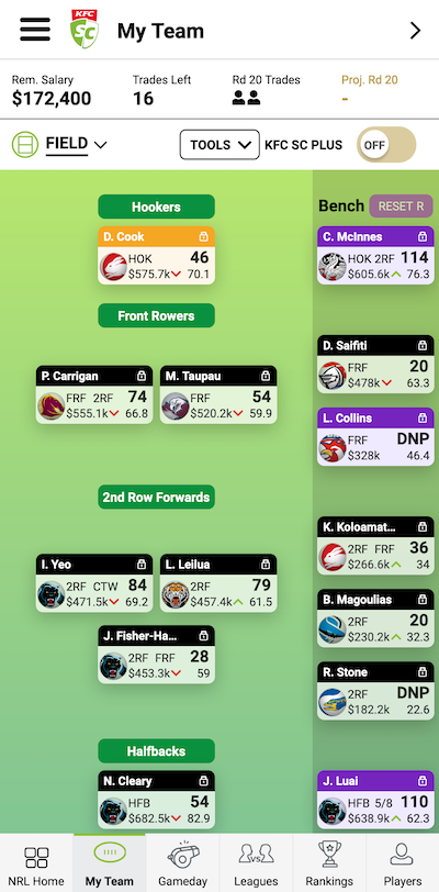 | 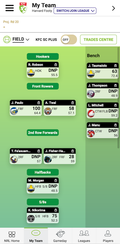 |
Challenge
The challenge was to create a more cohesive and user-friendly experience, particularly for new users. One consistent complaint I’ve received from new and existing members in my league is how cumbersome and unintuitive the app and website feels.
The current implementation of the interface is through a website and native apps on iOS and Android. The “native” apps are in fact a wrapper that takes the user to the mobile website. This means that the app itself doesn’t feel native and lacks the smooth and natural usability of a true native app.
A similar sentiment is echoed by users in the reviews of the app.
| iOS | Android |
|---|---|
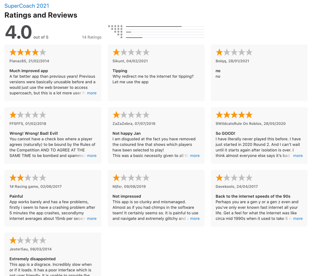 | 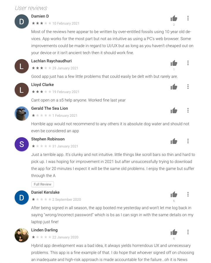 |
There are restraints with reworking the design, as SuperCoach relies on a lot of information and statistics to be shown on-screen at once. An oversimplification will result in a worsened experience for expert users.
User research and analysis
Interviews
I was able to interview 6 users of SuperCoach, all of varying experience levels. The purpose was to understand how the users used the app and website and to see what kind of pain points they experienced. To summarise:
- 4/6 users primarily access the app through their smartphones
- Majority of users play both Classic and Draft modes
- Majority of users are there to change their lineups for the week, pick up free agents and make trades
- All users interviewed only use SuperCoach for one sport: rugby league
- Majority of users check the app while watching the games to see how their players are performing
Users also had some things to say:
Visually the website and app look good, but it doesn’t feel easy to use
As a new user, I didn’t really know what to look for when comparing players and navigating around the app in general
I find it really difficult and tedious to review pending trades between teams
Personas
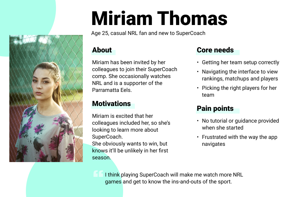
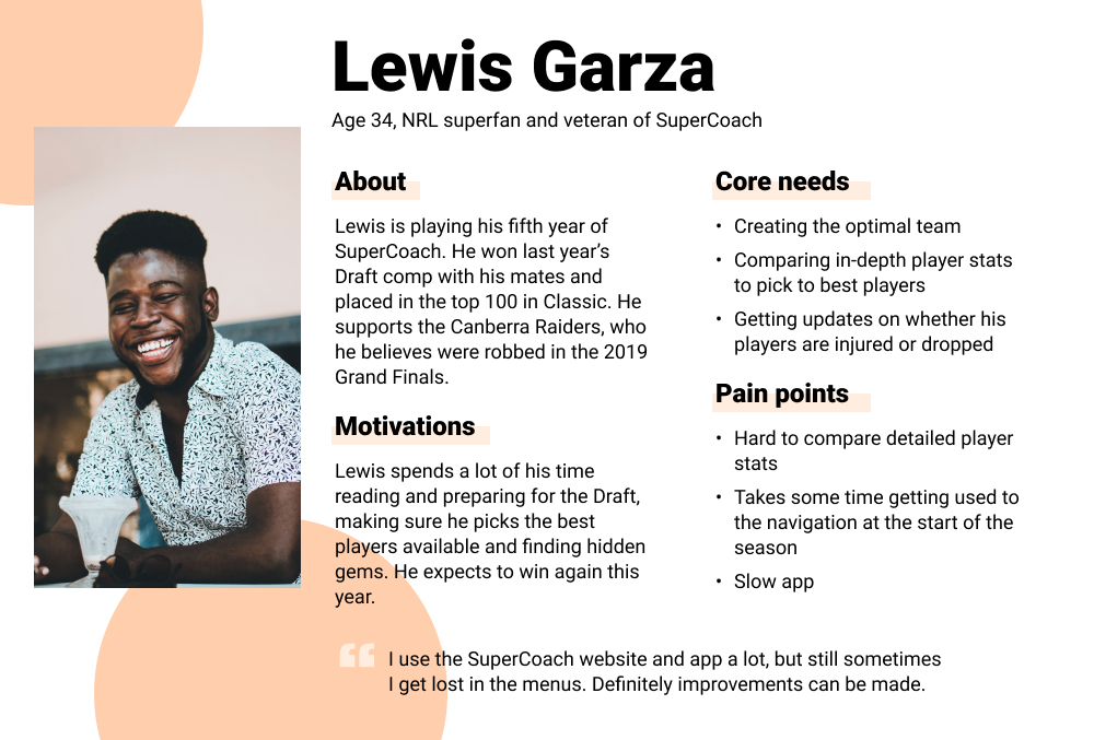
From the interviews conducted, I was able to create 2 distinct personas with varying levels of SuperCoach experience. These will guide me when it comes to creating the new designs.
Solution
My high level goals were to:
- Improve the information architecture and navigation
- Build up from a mobile-first experience
- Ease new users into the world of fantasy NRL
1. Information architecture and navigation
The existing navigation was the most common complaint from both new and experienced users.
Sitemap
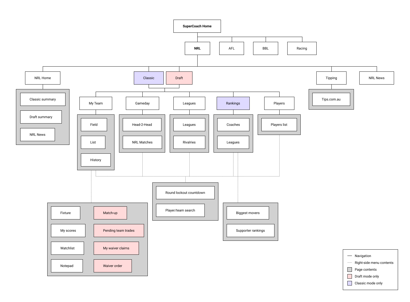
To better understand the overall structure of the website, I created a sitemap to visualise all the main sections and to break down elements within each section.
Hamburger menu
A key point of confusion for some users was the inconsistency of the hamburger menu and the navbar, on both desktop and mobile.
Before
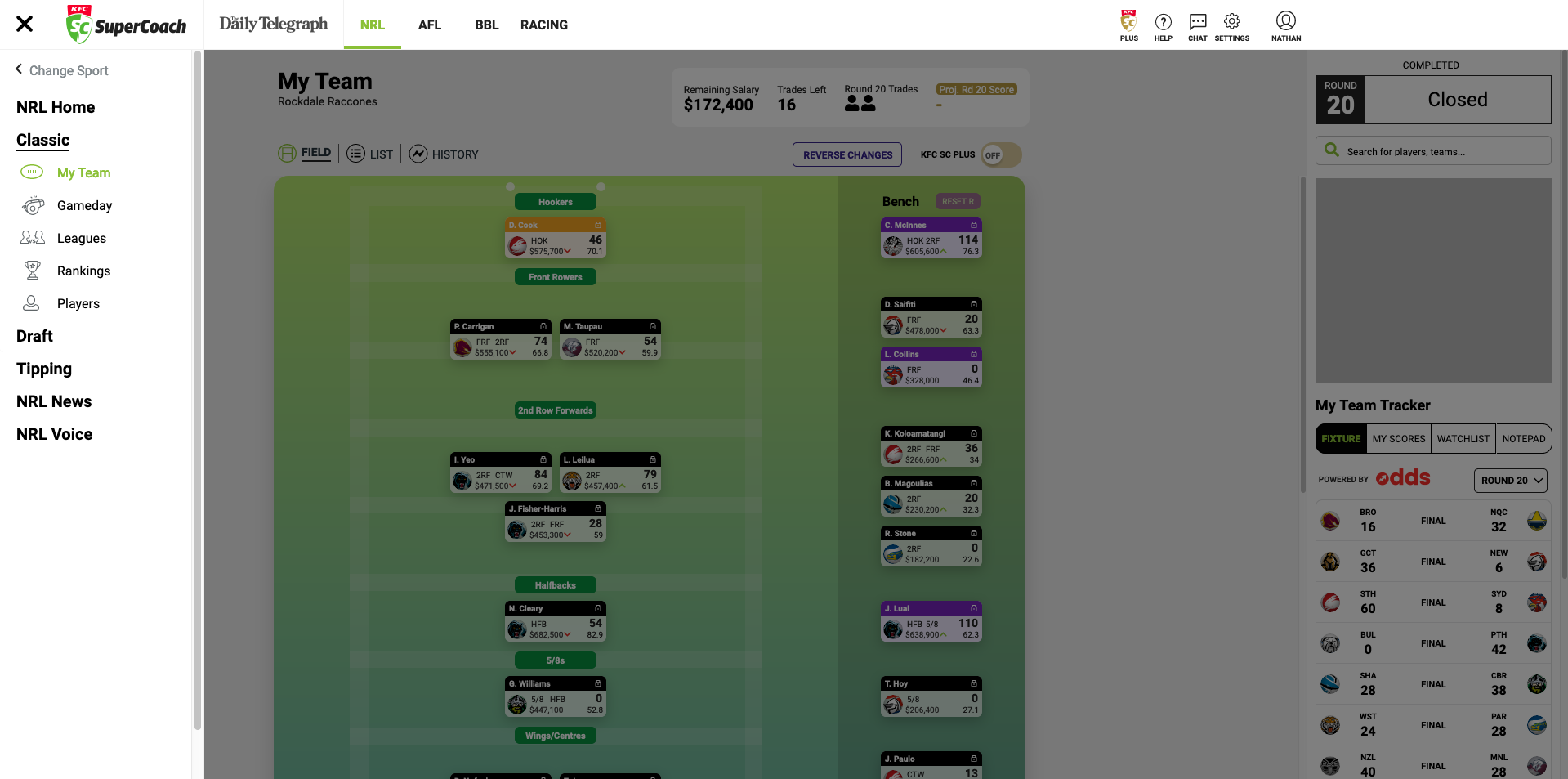
On desktop, the navigation menu was shown when clicking the hamburger menu button. The user can then navigate to different sections (My Team, Gameday, etc.) or change game modes. Research shows that on desktops, hiding navigation degrades the experience and the navigation discoverability more than it does on mobile.
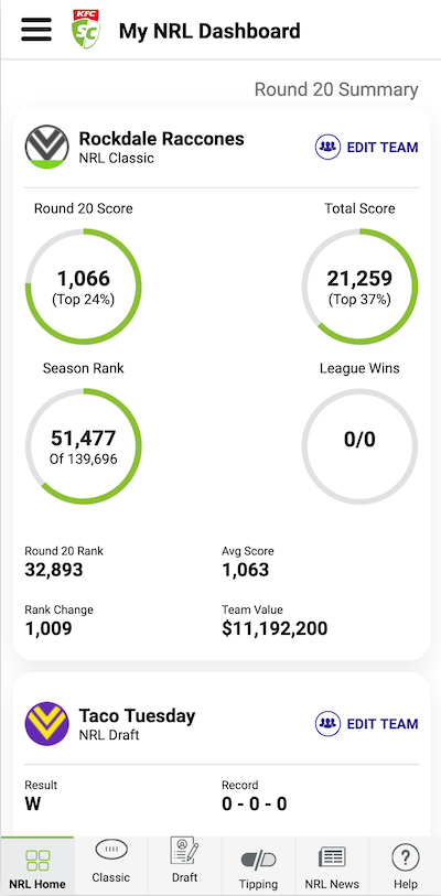
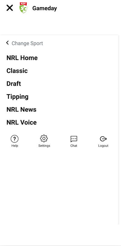
On mobile, the user would similarly click the hamburger menu (image 1 & 2) to show nav options, but they could also navigate with the navbar on the bottom. However, the behaviour of this navbar changes when the user clicks on Classic or Draft (see differences between navbar in image 1 and 3).
The hamburger menu on mobile also wouldn’t expand like in the desktop version to allow nav to other sections (My Team, Gameday, etc.).
| 1 | 2 | 3 |
|---|---|---|
 |  |  |
After
To make navigation faster on desktop, I decided to replace the hamburger menu with a streamlined navbar at the top of the page.
Since users tend to focus on only one sport, the option to change sports was moved to a dropdown menu, while high-level navigation (Home, Classic, etc.) moved to the top of the navbar. This allowed mode-specific navigation to be surfaced on the bottom of the navbar instead of hiding inside a hamburger menu.

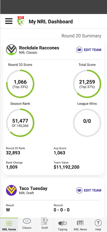
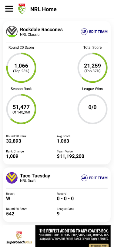
Due to the size restriction of mobile screens, the hamburger menu was kept the same as it was consistent with other mobile experiences. The bottom navbar was removed from the home screen and minor VD updates were made, allowing for more to be shown on screen at once compared to the original.
| Before | After |
|---|---|
 |  |
The “NRL Home” nav option was removed from the navbar in game mode screens as it was redundant.
| Before | After |
|---|---|
 |  |
2. Mobile-first design
The mobile-first design philosophy involves designing for small screens first, then building upwards. This ensures only the most essential features are used, leaving out the bloat.
My focus for the main deliverables of this project was to build on this mobile-first experience.
Wireframes
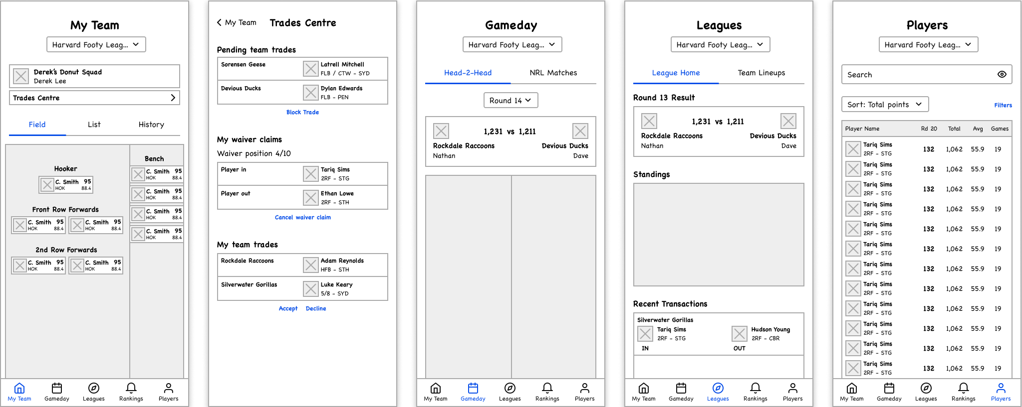
For each section, I began with low fidelity wireframes, mapping out the core layout of each screen and its fundamental elements.
My Team
The My Team section is where most users spend their time. They would figure out which players to be selected to play and decide if they would trade players here.
Before
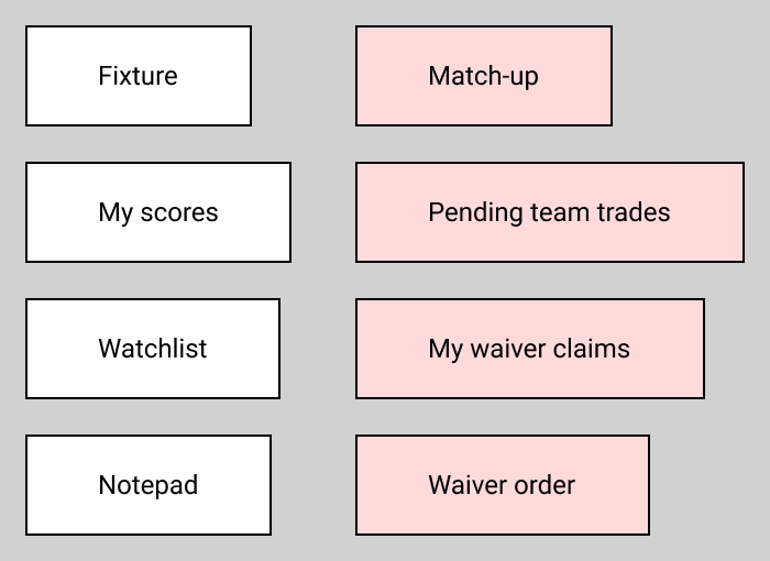
In its current implementation this section can be really information-dense, particularly when opening the right sidebar. The below image shows all the information shown within this sidebar (red is for Draft only).
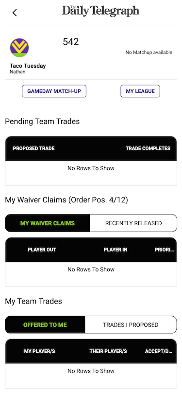
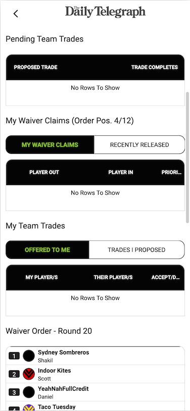
A key callout from interviews was the difficulty in finding pending trades. The reason for this is the amount of steps required to show pending trades.
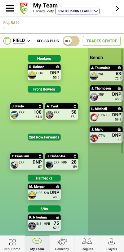
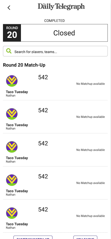
On the My Team section (1), the user could click either Trades Centre or open the sidebar with the > icon on the top right. Once opened, all current matchups would be shown (2). The user then had to scroll down below the matchups to see Pending Team Trades, My Waiver Claims and My Team Trades (3).
| 1 | 2 | 3 |
|---|---|---|
 |  |  |
After
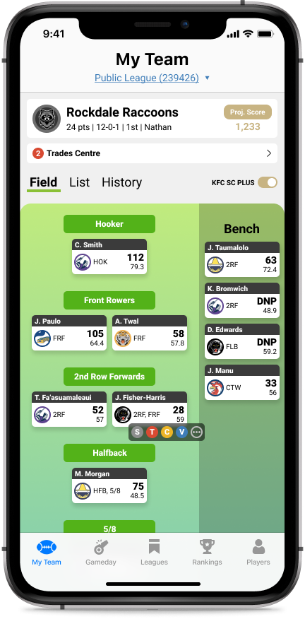
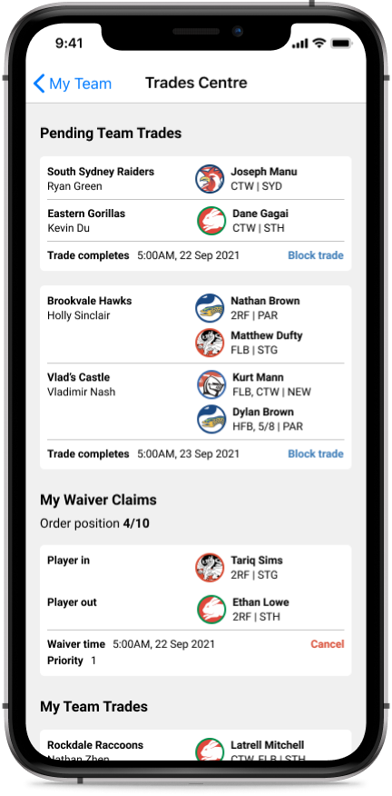
A simple fix for the problem is to move all the trade related sections out of the sidebar. This helps improve usability as:
- The sidebar is now consistent for both Classic and Draft. Both now only show Fixture, My scores, Watchlist and Notepad
- The Trades Centre button now has a distinct purpose
Now the Trades Centre button will contain a small notification badge with the amount of pending transactions (1), and when clicked it’ll show up as a modal (2).
| 1 | 2 |
|---|---|
 |  |
After-after
For a more drastic redesign, I looked at removing the sidebar altogether. This refreshed look allows the user to be focused on one aspect at a time, rather than being distracted by a sidebar (when on desktop).
The Trades Centre now has a dedicated modal for both desktop and mobile.
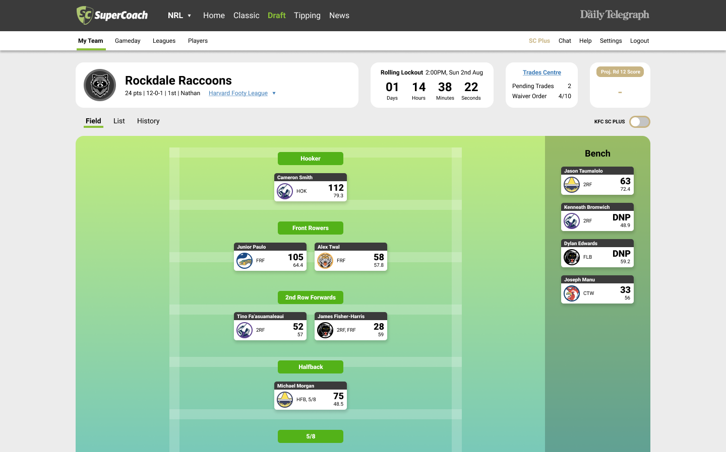
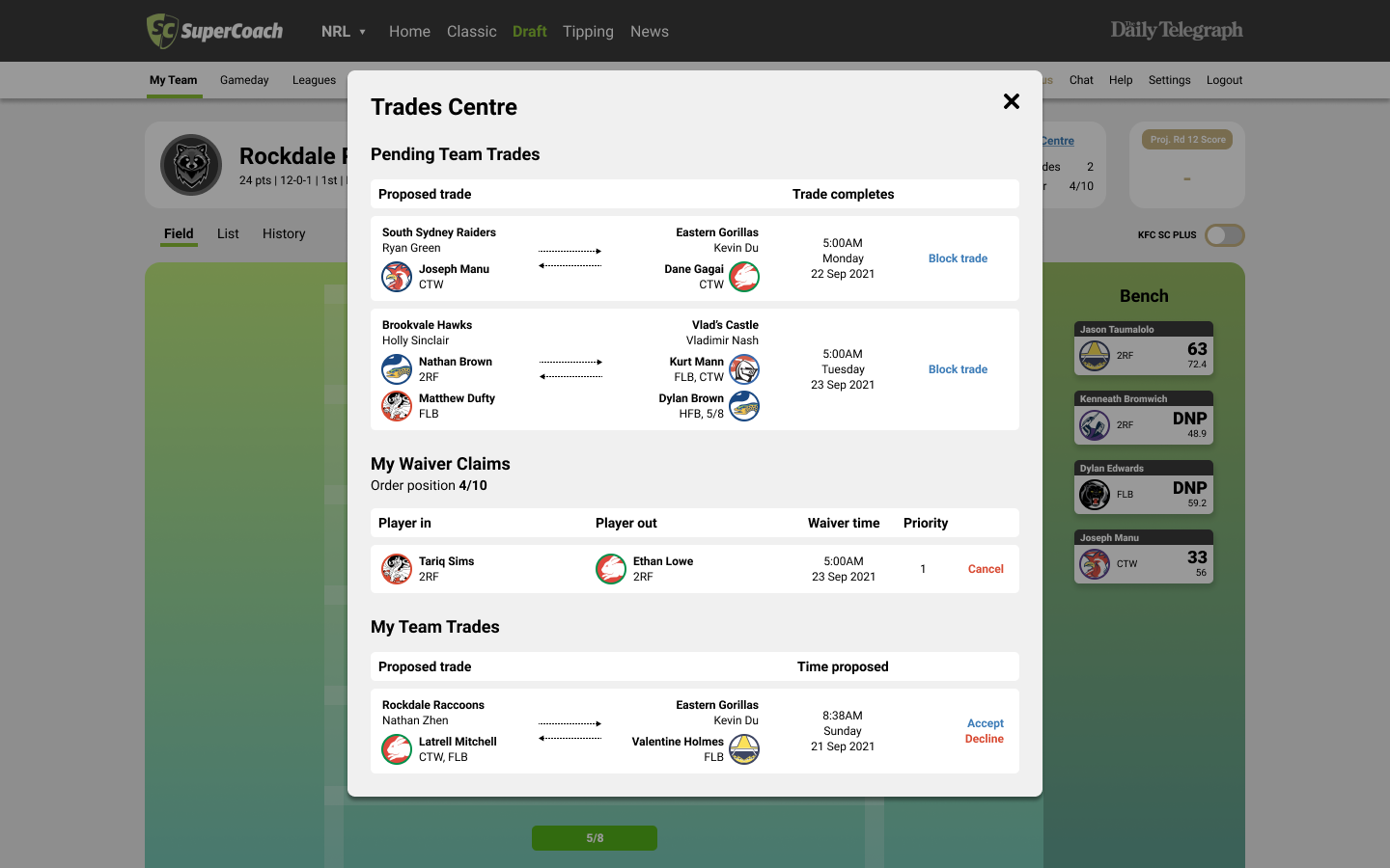
Gameday
Gameday is where to user goes to see who they’re matched up against and their scores. The user can also drilldown into specific matchups and see individual player scores.
Before
In Classic, the focus is on the user’s total score versus their matchup, and this is shown for all their leagues.
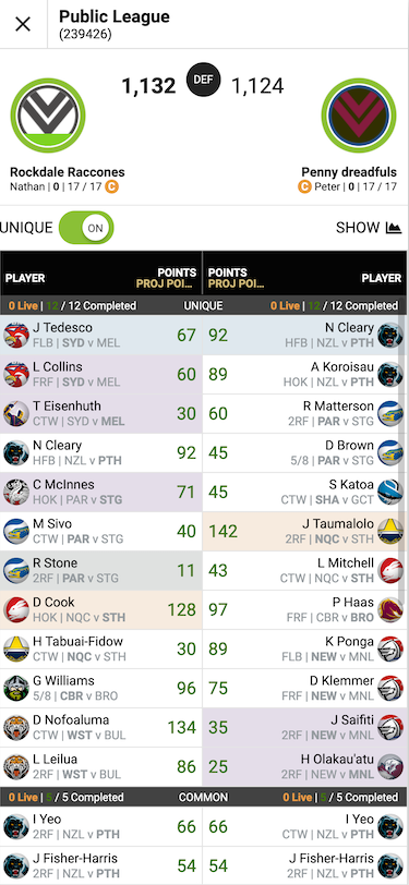
In Draft, only one league is shown, and it shows the scores for all matchups. These scores are also not ordered, so the user has to dig through to find their matchup.
In both Classic and Draft, the user has to click “See H2H Scores” to see individual player scores.
| Classic | Draft | Head-2-Head |
|---|---|---|
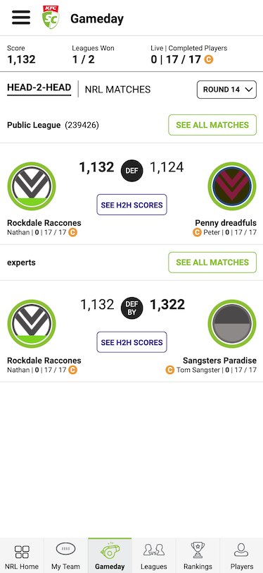 | 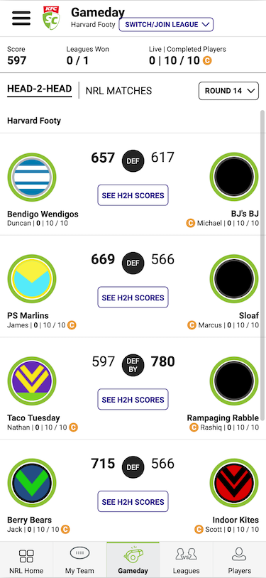 |  |
After
To unify this experience, the idea was to only show one league at a time in Classic (to be like Draft). While I also wanted to keep the option of seeing scores for other users’ matchups, the focus should be on the user’s own matchup. To save users a click, the player scores would also be surfaced at the top level.
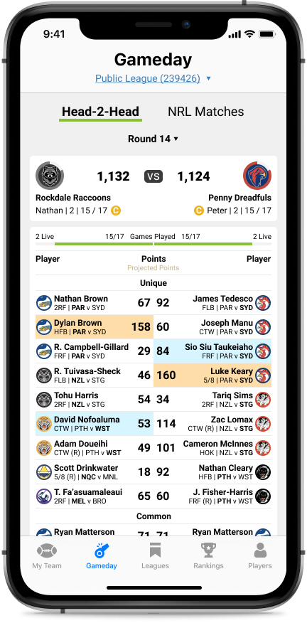
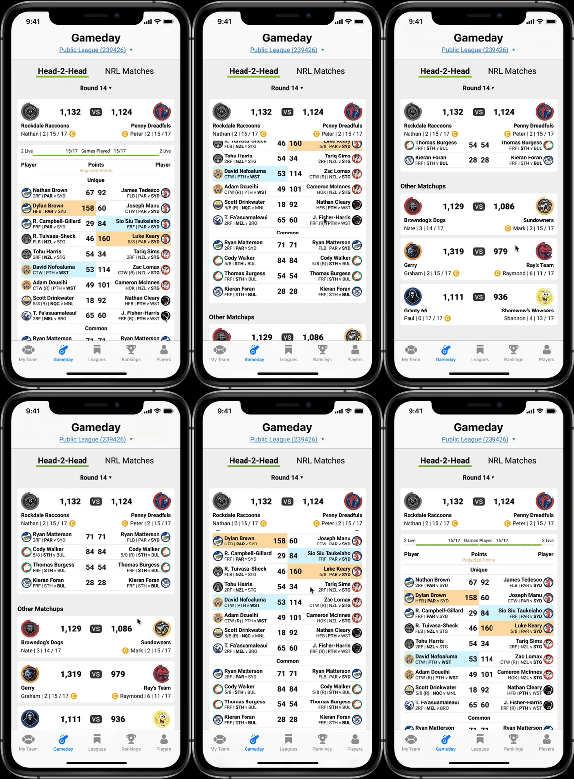
Since reserves weren’t any different to regular players on the field, I removed the purple shading as it added noise to the interface. Reserves are now signified with (R) next to their positions. This also provides more significance to the captain and vice-captain selections.
To see scoring for other matchups in the current league, the user can scroll down past their current matchup.
Leagues
The Leagues section is where the user goes to see what’s happening around their league. It’s most commonly used as the entry point to view standings.
Before
Similar to Gameday, the Leagues section has some differences in Draft and Classic.
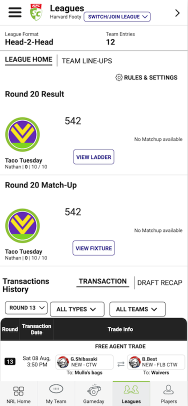
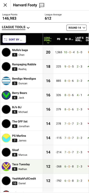
In Draft, the default is to show the details of a single league:
- Results
- Matchup
- Ladder
- Fixture
- Team line-ups
- Transaction history
The additional drilldown to view standings (View ladder button) is a pain point for many of the interviewed users.
| Draft Leagues | Ladder drilldown |
|---|---|
 |  |
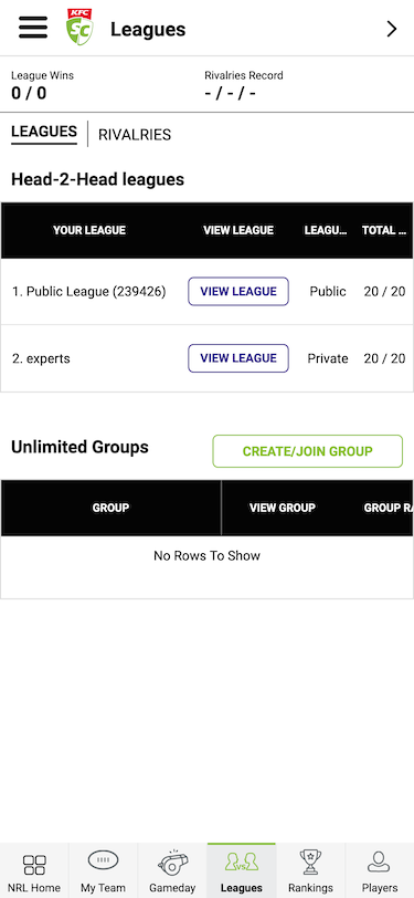
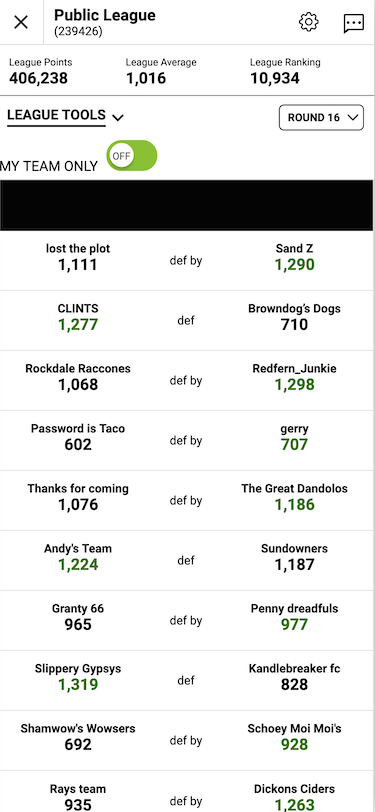
In Classic, there is an additional layer that shows all the leagues the user is a part of, requiring another drilldown to show the details of the league.
| Classic Leagues | Fixtures drilldown |
|---|---|
 |  |
After
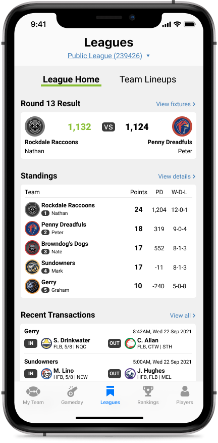
To keep it consistent with Gameday and Leagues, there is a league selection at the top in both Classic and Draft.
The most important information would be surfaced directly on this page, saving a click from the user to see the current standings. The recent transactions section has also been updated visually to take up less space and is now easier to read.
Players
The Players section is where the user goes to research and look for players to add to their team. This is where serious players spend a lot of their time in fine-tuning their team.
Before
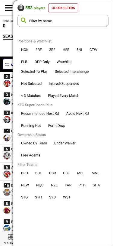
A table containing all players would fill this section, defaulted to sort by highest points total. For each player, it would also show their ownership status (Draft) or their price and price movement (Classic).
A filters modal is used to narrow down players. Most users interviewed said they would look for free agents and players under waiver while in the Players section. That is, they don’t care who the best players are, they just want to see who the best available players are.
| Players | Filters |
|---|---|
 |  |
After
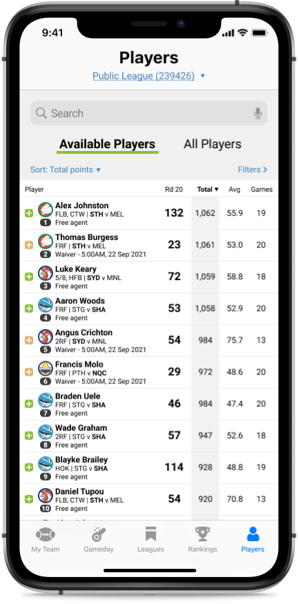
Based on the above findings, I changed the default behaviour of the Players section to display available players (free agents and waivers).
Additionally, there are new sorting options available for more advanced users. Users can now sort individual stats (tackles, tries, linebreaks, etc.) by the following criteria:
- Total
- Average
- Average past 3 or 5 rounds
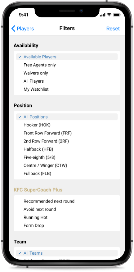
Filters were also updated to increase legibility and reduce cognitive overload for the user.
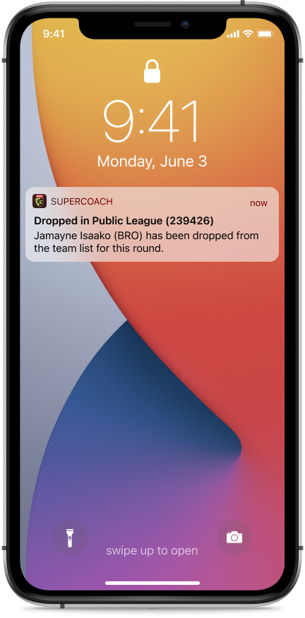
Notifications
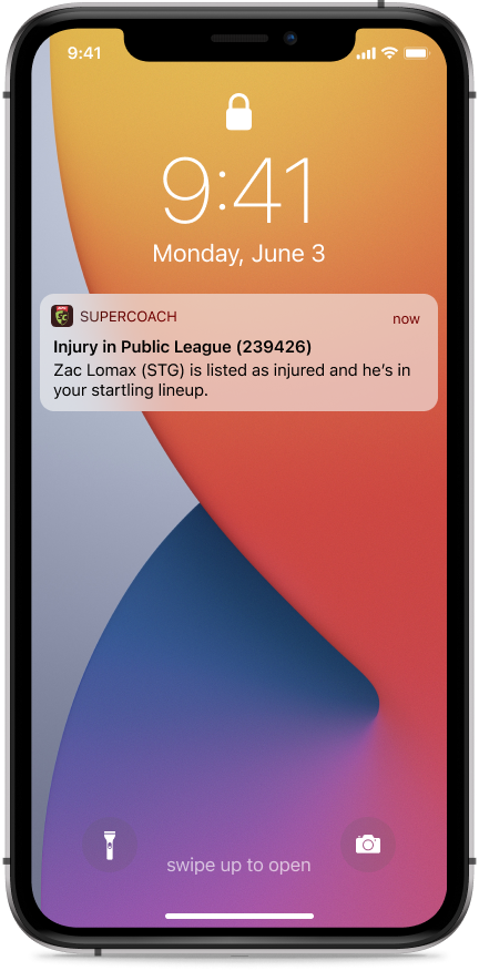
The addition of notifications is a small quality-of-life enhancement that would benefit users that do not follow team updates religiously. The current process for players is to check the teams list in NRL.com prior to lockouts to make sure their players are active and playing.
Push notifications will ensure newer users are not disadvantaged by playing injured or dropped players.
3. Guide the newbies
For most users new to fantasy sports, or even fantasy rugby, there is an overwhelming amount of information and lingo to wrap their head around. I feel that the current state of SuperCoach does not do a great job in onboarding inexperienced users.
Onboarding and tutorial
Before
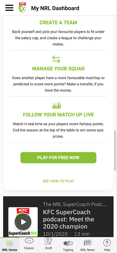
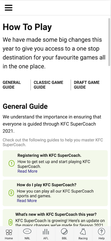
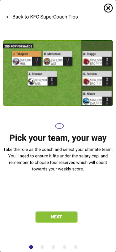
There is a basic tutorial that exists, but it’s hidden inside a small link on the homepage (1 - See how to play link). When prompted, none of the interviewed users were able to find and access this link.
Accessing this link shows the basic guide (2), where the user is finally able to access the introductory tutorial (3). Pretty hard to find.
| 1 | 2 | 3 |
|---|---|---|
 |  |  |
After
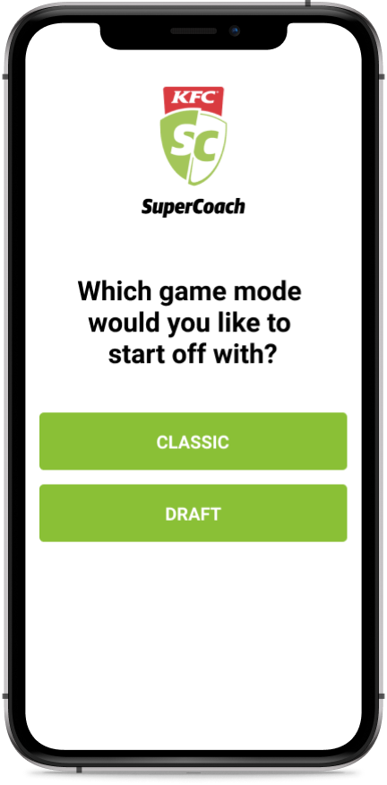
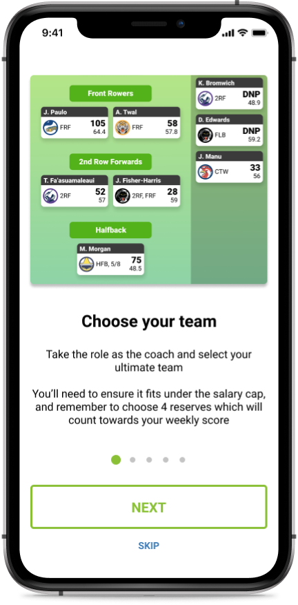
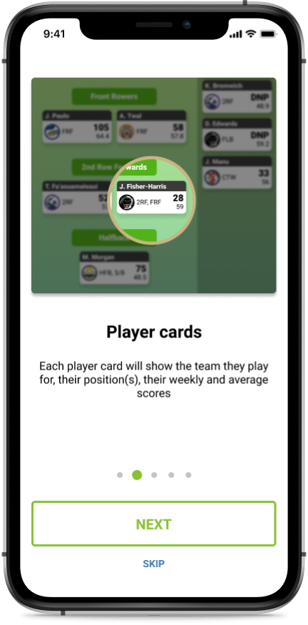
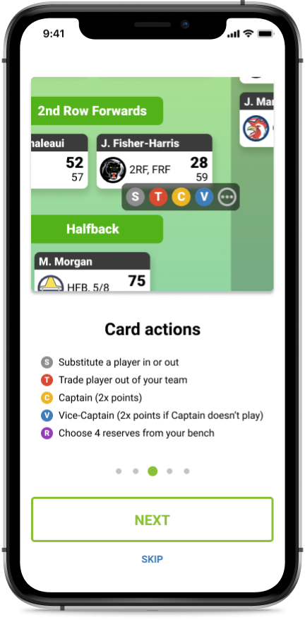
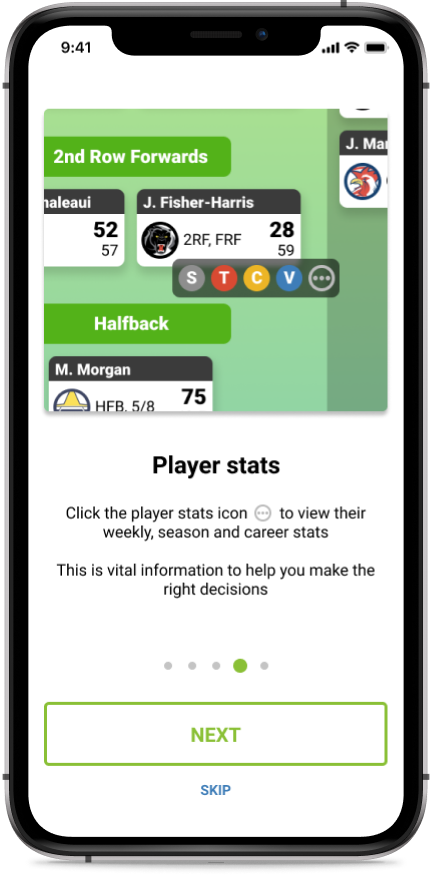
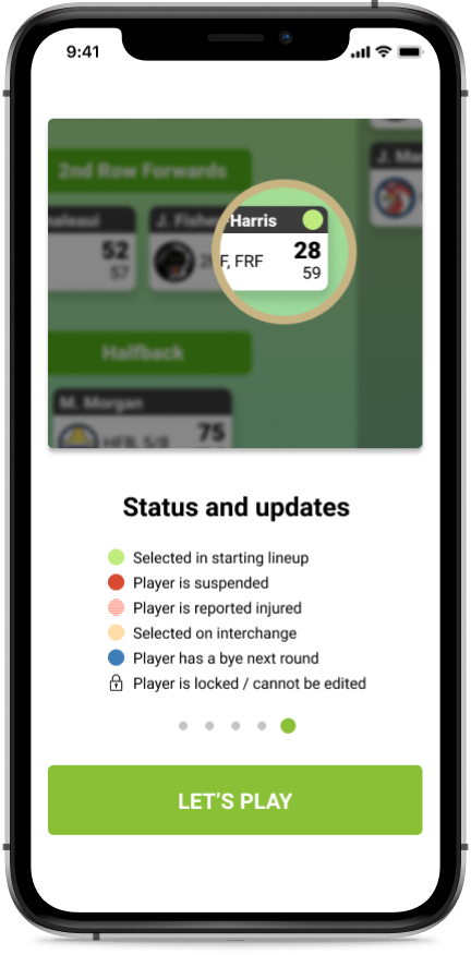
A redesigned onboarding experience integrates the existing tutorial, with two paths (one for Classic and another for Draft). This streamlined experience is something a majority of users would be accustomed to, as it’s similar to existing mobile app onboardings.

Help and FAQs
Before
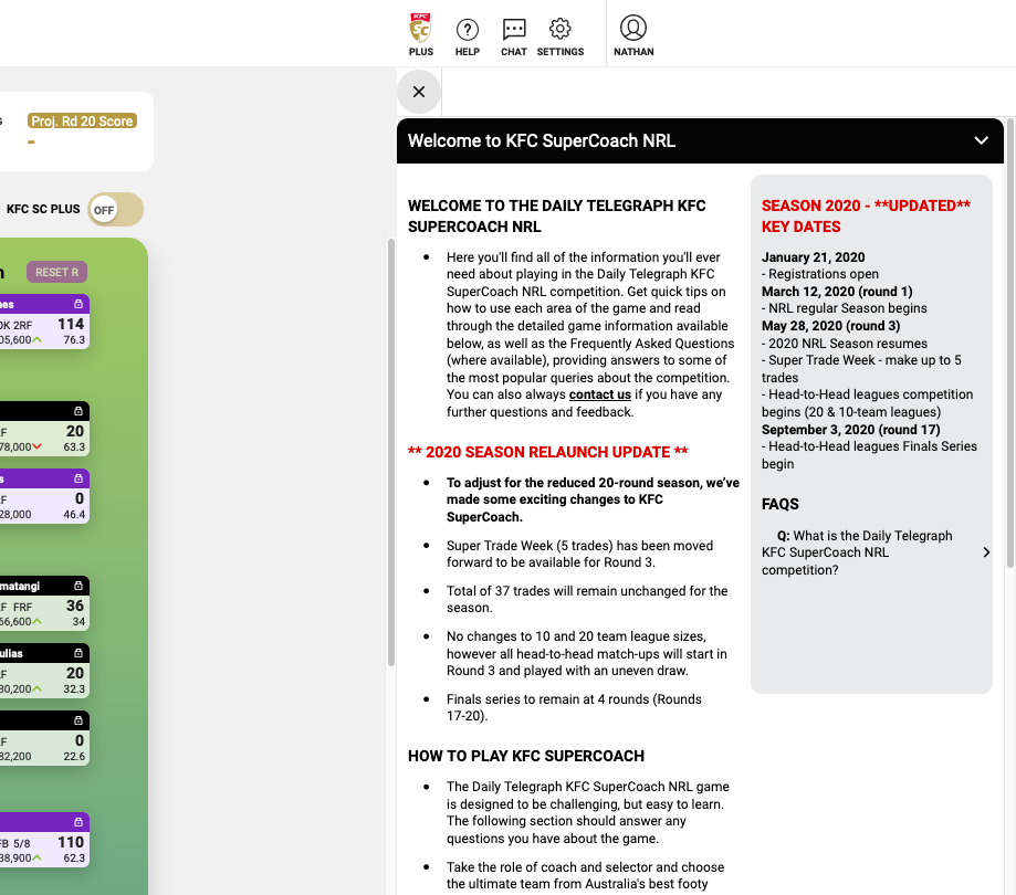
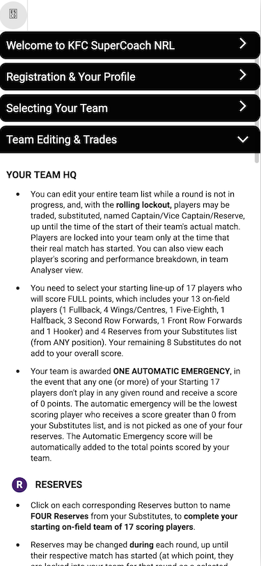
When viewing the help section within NRL SuperCoach, it’s quite in-depth and intimidating for a beginner. It looks like a bulletin message from the early 2000’s with the amount of red and asterisks used. The wall of text also doesn’t do the help section any favors.
| Desktop | Mobile |
|---|---|
 |  |
After
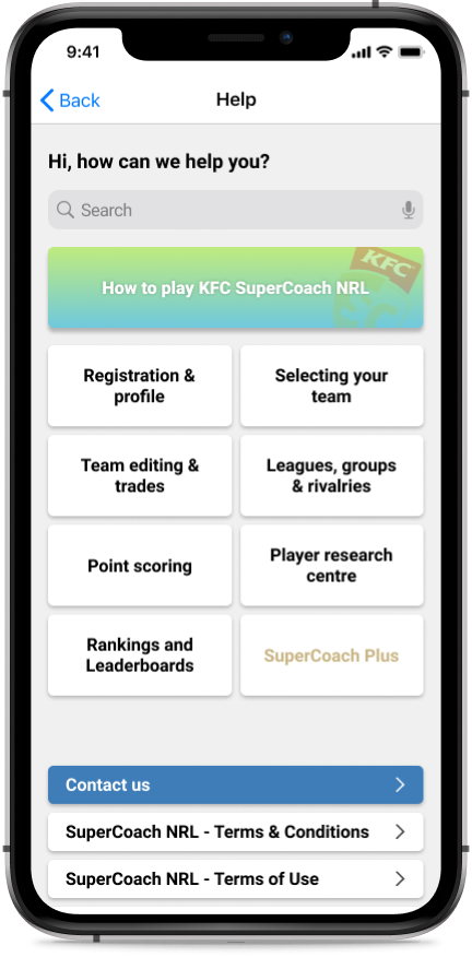
A visual overhaul of the high-level elements makes it easier to read and helps the user find what they’re looking for. The search bar also speeds up discovery of help topics.
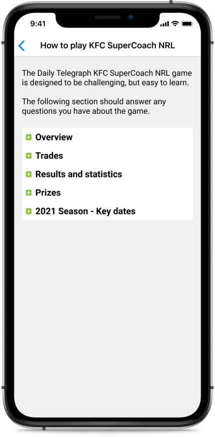
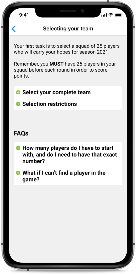
No content was changed, but inside each help article, the walls of texts are chunked down into sections that the user can expand/collapse, making it easier to read.
Conclusion
Over the two months that I had worked on this project, I have gained a vast appreciation of the work involved in building a complex app like SuperCoach. There is a skill in finding a balance for both beginners and experienced users.
This was a challenging project to undertake solo, going from research to design, but rewarding nonetheless. I was able to prioritise the key features that needed to be fixed to improve the experience for most users, but there are still many smaller issues to address.
I was able to garner feedback from users and it has been overwhelmingly positive, as a majority feel that a rework was overdue.
I’d also like to thank the willing participants to my research.
Next steps
- Usability testing my existing prototype to determine what difficulties users would have in completing tasks
- Gather my findings from the usability tests and create higher-fidelity prototypes
- Iterate
- Work together with the Daily Telegraph team in bringing this idea to reality
Final thoughts
Overall, I’m very happy with how the prototype has turned out and I’m looking forward to building on it. It was also a fun challenge working on something that I use nearly daily, knowing that it could potentially improve the experience of 130,000 other users.
